LaChérie
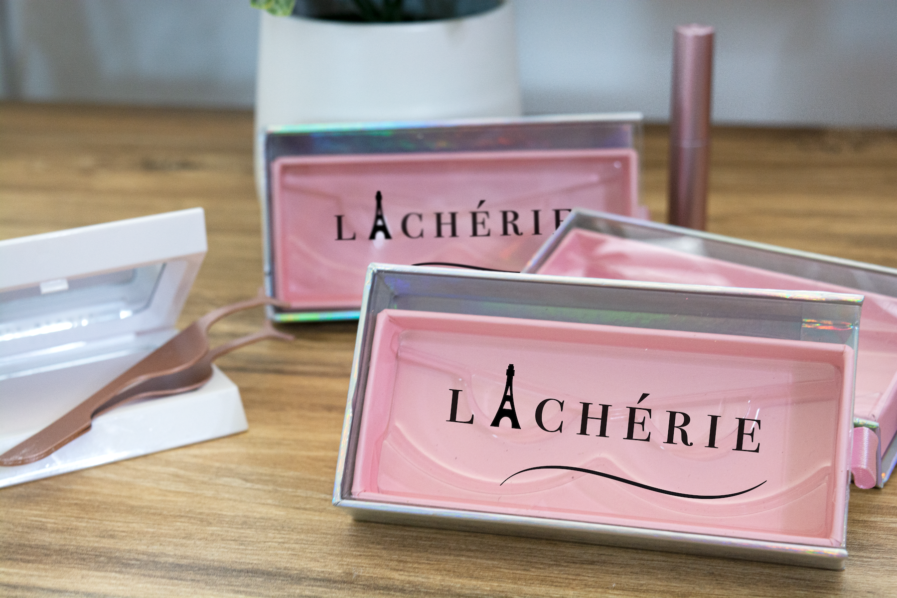
The objective of the project was to create a logo for a particular item. I created a design intended for a false eyelash franchise. The franchise would sell both magnetic and regular lashes that come in many varieties of styles and shapes to the consumers liking. The logo represents the companies overall theme, Paris.
Type of Project:
Logo Design
Client:
Class Assignment + Self Study


My Approach
Illustrating the Eiffel Tower.
The name of the product is LaChérie, and the motive was to illustrate an idea that symbolizes femininity and classiness. The Eiffel Tower is what gives the name a french impression and look to it. The wavy line at the bottom of the logo is an eyelid that defines what LaChérie will provide for its consumers. The entire logo highlights the overall theme and most importantly represents beauty which is what LaChérie stands for.

